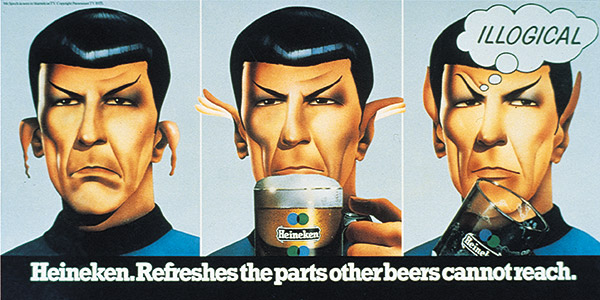
Like many people I was saddened to hear of the death of Leonard Nimoy. I had spent much of my youth eagerly watching the adventures of the Starship Enterprise. But, being an advertising man, Nimoy’s death brought to mind something else: a poster that I consider to be the greatest-ever created for the famous ‘Heineken refreshes the parts campaign’: Mr. Spock’s pointy ears in need of refreshment.

In essence, this poster was the result of the combined talents of four people being channeled into a single endeavour. They all worked at the agency that created the poster, Collett, Dickenson and Pearce (CDP). It just so happens that I wrote a short piece about the creation of the poster last December for the advertising news website, More About Advertising, as part of my Desert Island ads. The Mr. Spock poster was one of my choices. With Leonard Nimoy’s death, it now seems timely to expand upon that explanation of how the poster came about.
Copywriter Tony Brignull received a brief to do a 48-sheet poster for Heineken and had the idea of using Mr. Spock’s ears. He’d been inspired by a Heineken script that Terry Lovelock had written that was a spoof of Star Trek. Terry, of course, was the man who woke up in the middle of the night in a Marrakesh hotel room and scribbled the words ‘Heineken refreshes the parts other beers cannot reach’ on a piece of paper. This was after months of trying to write a campaign to answer the one-word brief, ‘refreshment’. But that’s another story. Let’s get back to the poster.
Tony Brignull’s usual creative partner, Neil Godfrey, was away, so Tony wandered the CDP creative department until he found an art director to visualize his Spock idea. The art director he chose was Paul Smith, with whom I worked at the time. Paul set to work drawing up the idea as a triptych: one frame showing Mr. Spock’s ears drooping, one showing them starting to revive, and a final frame that showed the ears pointing upwards, as they should be. It was at this stage, as he drew the final frame, that Paul added what many consider to be a masterstroke. He drew a thought bubble and placed the word ‘illogical’ within it. With one word, Mr. Spock’s catchphrase, Paul had turned a good poster into an even better one.
The poster was presented to the client and approved to go into production – only it didn’t. For a long time, the poster hung around because nobody could track down Leonard Nimoy to photograph him. At one stage Tony Brignull became so frustrated with the poster’s lack of progress that he stormed into the office I shared with Paul and ordered Paul in no uncertain terms to get on a plane and fly to New York to photograph Nimoy. Nobody, of course, least of all Tony Brignull, had any idea of where in the world Leonard Nimoy was. So Paul didn’t go to New York, or anywhere else come to that. Leonard Nimoy was nowhere to be found. But Paul was sufficiently shaken up by Tony’s fiery visit that he asked his group head, Alan Waldie, what he ought to do about it.
With a wry smile Alan looked from Paul’s worried face down at the rough of the poster. ‘The way you’ve drawn this, it looks like a comic. Instead of a photograph, why don’t you use an illustration? You never know, it might be better.’
Alan recommended that Paul ask Philip Castle to do the drawing, which Paul duly did. The result? A tour-de-force of a billboard and, in many ways, the sum of the work of four creative people: Terry Lovelock who wrote the campaign line and the inspirational Star Trek script; Tony Brignull who had the idea of using Mr. Spock’s ears; Paul Smith who added the ‘illogical’ thought bubble; and finally, Alan Waldie, who suggested using Philip Castle.
No wonder it won the D&AD Silver award for the best poster of 1975. Even now, forty years later, its impact and freshness lives on. It’s a pity that the inspiration for the poster, Leonard Nimoy, no longer does. At 83, you could argue that Leonard Nimoy lived long. And presumably, due to his successful acting and directing career, prospered. So let’s raise a glass to his memory – Heineken, of course.
