A good question, and one that head of Openeye Consulting, Deborah Samuel, asked us at Anatomised. She wanted her firm’s website to operate like an advertisement for her business, from the landing page, through a dozen or so case histories, to the contact page.
When we thought about it, of course, every website is an advertisement for the business it represents. But not all websites act like one. Many are more like Power Point presentations than ads, and not very good ones, at that. Few websites seem to grab the chance to sell off a web page with both hands.
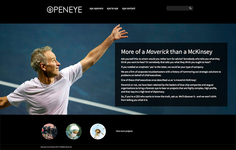
Before we created anything, we spent several hours with Deborah talking about Openeye and what it had achieved. Like every creative endeavour, there were a few false starts. But in our meetings with Deborah, she kept telling us that Openeye wasn’t a firm of consultants in the McKinsey sense; she believed that her firm was less conventional. In one memorable meeting she told us how one of Openeye’s clients had described it: ‘More maverick than McKinsey’.
That was it. That was the thought that unlocked the creative process. Immediately, this memorable sentence suggested the heading for the landing page: ‘Openeye, more of a maverick than a McKinsey’. More than that, it informed the structure and ethos of the entire site. We wrote every case history as a kind of mini advertisement, with its own dedicated headline, copy and illustration – just like a print advertisement, but in digital form.
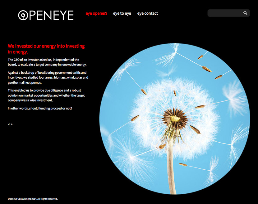
Meanwhile David Hughes, set to work on the look of the site. Openeye’s thinking is clear, precise and simple. He wanted the site’s appearance to reflect this. In the event he developed a crisp, clear style, with only three buttons on the navigation bar: Eye Openers, which led to the case histories, Eye to Eye, which led to a profile of Deborah Samuel and Eye Contact, which led to the contact page.

The case histories themselves are illustrated with circular images that echo the circular ‘target’ device of the Openeye logo. But the pages contain only three elements: the illustration, the headline and the copy; another reflection of the clear and precise approach Openeye take to their work.
You can see the finished result at www.openeyeconsulting.co.uk If anything proves that a website should be an advertisement, we believe the Openeye site does.

